
Spectrum Fantastic Art Live 2013 is over, and I am finally back home and able to process everything. I want to extend my thanks again to Muddy Colors for setting everything up and providing me with such an amazing gift. This weekend was truly unforgettable. To all of the fantastic people I met this weekend and artists who will inspire me for years to come, I say thank you. I also want to congratulate the winners of Saturday night's award ceremony--all of the nominees had absolutely stunning work on display. What a crazy time to be involved in the world of Science Fiction and Fantasy Art. It's actually getting harder to keep track of where the boundaries lie and just exactly where to classify it all. Beautiful art goes well beyond genre I suppose, and SFAL '13 was chock full of nothing less.
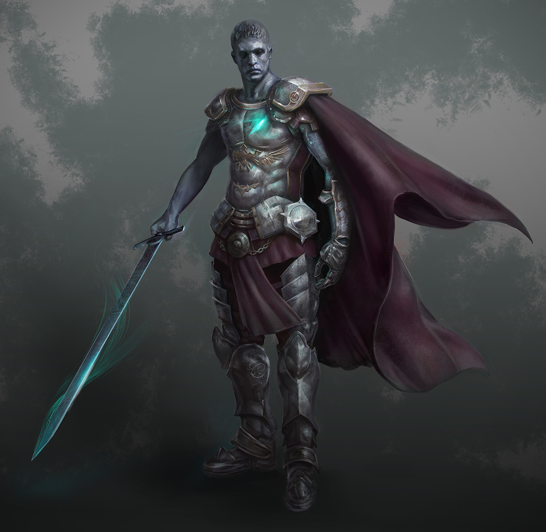
I've already hit the ground running since getting back, and feel as though I've grown a lot and learned much in such a short amount of time. I'm already looking forward to next year, and hunkering down to cover as much ground as I can. Here are two pieces I finished for Applibot before flying down to Kansas City last week that I would like to share with you. More to come soon! Thanks again, everyone. :)


.JPG)

.JPG)


.JPG)


